Gold is yellow, right? Well not really: some golds are more yellow than others. The two icons of St Francis above are looking like one of those 'spot the difference' puzzles we used to get as children, but the chief difference - the colour of the gold leaf I used in each - is not at all obvious on the screen. When you go to buy a book of gold leaf - generally from an on-line supplier - the array of golds on offer is completely bewildering. Bog standard 'yellow' gold can be 24, 23 or 22 carat, extra thick, double thick or regular, and each differs slightly in its tone. Not enough difference to read on a computer screen perhaps, but very obvious if you accidentally mix them up on the same painting (yep, been there!). Then there's Italian gold, German ducate, moon gold, red gold, lemon gold, green gold, champagne gold, white gold - the computer screen doesn't give one a very good idea of the differences and sample books are very expensive. The different colours are determined by the quantity and type of alloy metals in the leaf - silver, copper, nickel etc. 24ct gold, being pure, is a rich yellow colour; 22ct tends to be slightly more silvery. Some gold leaf has more of a crinkly texture, which you may or may not like. The presence of copper in the mix makes the leaf appear pinker (one sees this reddier tone clearly in gold jewellery made in India, for example).
So how to choose? Well, anything below 22ct is likely to tarnish fairly quickly, so is best avoided for work that you want to last: that instantly eliminates quite a number of options offered by the goldbeater. 24ct gold is more malleable and does not tarnish at all, so is chosen for 'best work' and for anything that will be exposed to the outside air. It is softer and therefore show the joins between leaves less after burnishing. Using 'double' or 'extra thick' gold leaf may mean you can avoid double gilding, which is generally necessary in order to get a good finish with standard thickness leaf: it is more expensive than standard thickness, so you will have to calculate whether with luck and skill you will make a saving or end up having to double gild anyway! For work intended to stay indoors, so less exposed to atmospheric pollution, 22 ct is adequate and perhaps a little easier to handle on the cutting pad. Beyond those parameters, you can let your choice be dictated by personal taste and price. The second of my St Francis icons (dated 2017) was made with 23 ct red gold, which I bought this time for no better reason than that it was older stock being offered at the old price. I like the way its warmer tone sits with the reds and browns of the icon - I have yet to decide whether it will sit comfortably in other pieces.
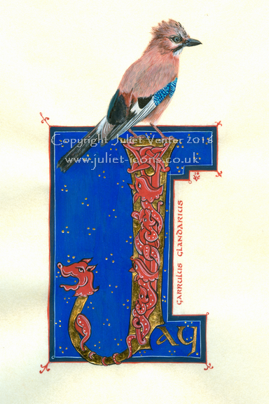
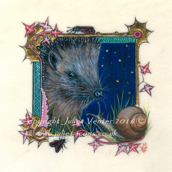
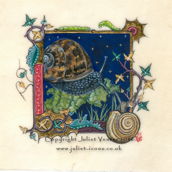
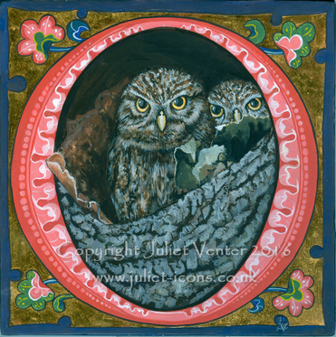
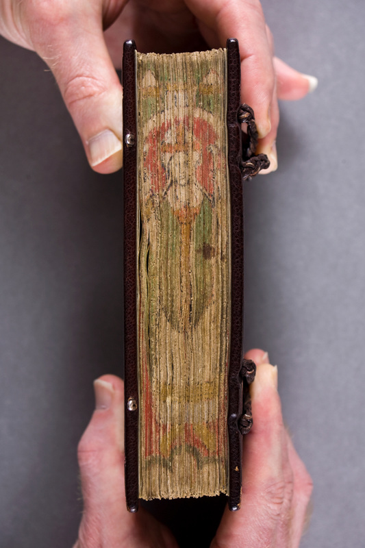
Not just for Christmas, of course. It's that time of year again when the galleries are preparing for their pre-Christmas private viewings and smaller paintings which will make good gifts are in high demand. For Norton Way Gallery in Letchworth I have painted a whole range of creatures great and small, including some more in my 'Night in the Garden' series of illuminations on vellum about which I have posted previously. I'm running behind as ever, and there are several starlings, a number of saints and a Nativity illumination unfinished on my desk...
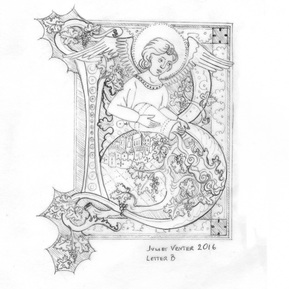
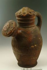
I was so excited to receive a commission to design an illuminated letter B for a Californian boutique wine producer's new range of organic wines. The brief (an angel watering a vineyard) seemed like the perfect marriage of my diverse interests! We agreed the design and just as I started laying in the colour I received word that the company was making a change to its business plans and so my artwork would not be needed after all. Too sad... No doubt the drawing will get recycled somehow - I am posting it here as a little RIP to the project, together with a photograph of a wonderful medieval watering pot which I turned up while I was researching the detail. I want one, any potters out there?
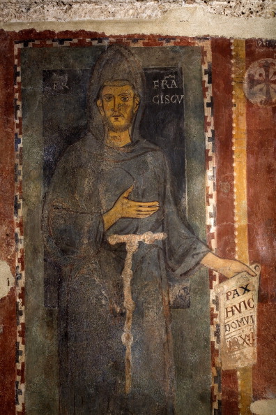 St Francis Fresco, Subiaco Monastery St Francis Fresco, Subiaco Monastery Yesterday we woke up to the news that Norcia in Italy has again been hit by an earthquake. Thankfully this time there seem to be no human casualties, but word is that the ancient Benedictine monastery of Subiaco has suffered bad damage. I wonder how its famous fresco of St Francis has fared? It's thought that it must have been painted when Francis was still alive (on earth, that is) because it is inscribed 'Brother Francis', and there is no halo. A couple of years ago I was commissioned to make an small icon based on the fresco as a gift for Professor C H Lawrence, historian, who among his many achievements has written the definitive history of the mendicant orders in the medieval world. The scroll he is holding reads 'pax huic domui' - peace be on this house - with what I think must be a date underneath, 1228? 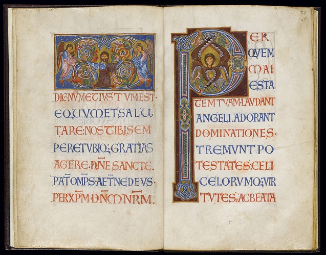 I was hard put to it to decide which beautiful picture to use as an illustration of my recent visit to this exhibition and eventually decided on this page from a Latin Kingdom of Jersusalem sacramentary, dated around 1128. I love it for the east-meets-west style of the icon panel, and the beautiful versal script. I am learning how to write versals at the moment, this is definitely one to add to the study list.
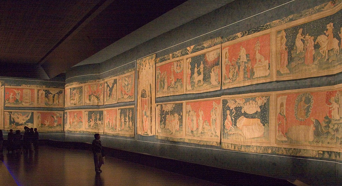
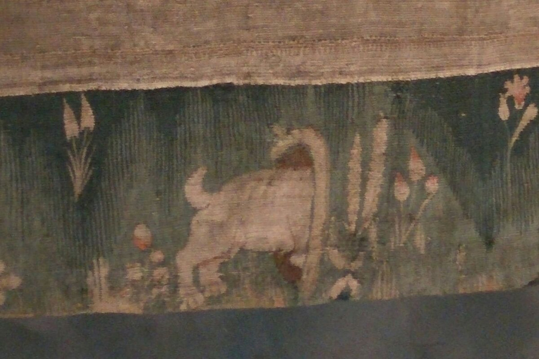
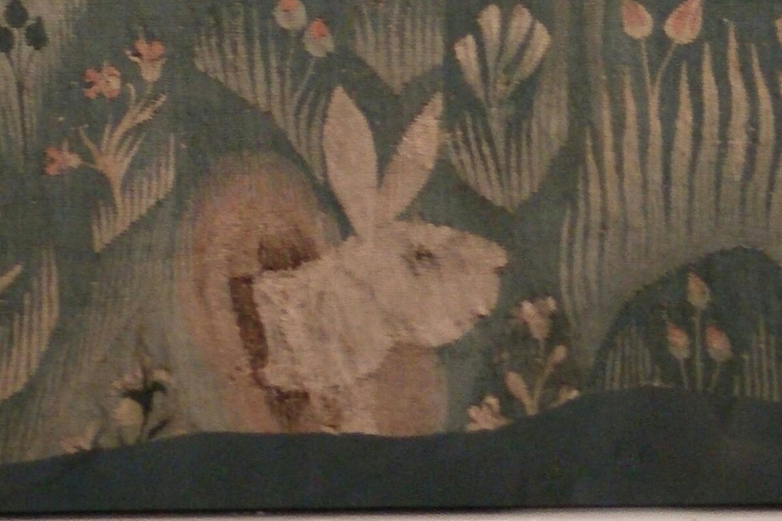
A must-go exhibition for iconographers, illuminators and scribes - on till December, so don't miss. Many of the manuscripts are in cases of course, giving the usual difficulty for close examination, but there are many cuttings framed on the wall which one can eyeball closely. There are also handy reference copies of the £30 exhibition catalogue lying everywhere, which means one can examine photographs and read up on detail without expense. Give yourself a good couple of hours and try to get there early before the usual headphone brigade are there blocking the view! Many of the manuscripts are from the University collection, but there are also borrowings from the British Library, the Archbishop of Canterbury's Library and elsewhere. The later medieval and early Renaissance period is quite heavily represented, as one might expect. The show's chief focus is on the chemistry and provenance of pigments and materials used in book illumination but technique is also touched on. Iconographers will be interested to study the gradual development of different fleshpainting techniques, from the fully modelled style of the Byzantine period through to western experiments with pointillism, grisaille and tinted drawing. Other random gleanings that I shall follow up on my next trip: - Different ways of ruling the page: pricking, hardpoint, silverpoint, plummet. Medieval readers preferred their pages to be ruled and even drew in guidelines to the first printed books because the page looked naked without! So this business in calligraphy class about not showing the lines is a load of rubbish, ha! - Using black gesso under gilding for special effect. Must try, could look amazingly contemporary. - Indigo and woad are chemically indistinguishable when used as dyes or pigments. Western artists probably used woad. It will grow in the back garden, and I found someone on line who extracts and sells the pigment. - The fabled Tyrian purple, so expensive, was extracted from North Atlantic dogwhelks as well as from the Mediterranean murex. The farthest Scottish islands had a trade in it. On the other hand there was a cheap subsitute to be made from the turnsole plant or a variety of lichen, used on some of those glorious purple-dyed manuscripts. - Some French manuscript fragments c 1250 were described as having a 'stained glass palette', an artistic cross-fertilisation from the contemporaneous technological developments in coloured glass (remember that amazing Chartres Cathedral blue?). One of the pigments used was minium. I have always held off using minium (red lead) on the grounds of it being so toxic, but I suppose that's a bit daft given that I already use vermilion (mercury), white lead (for gesso) and the cadmiums. I am interested in this manuscript school, and up till now have had to guess at what pigments were used to achieve the effect.
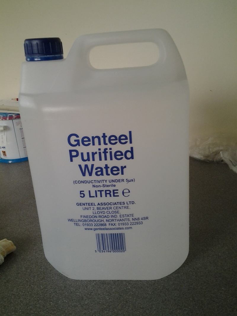 Upwardly mobile water for paint mixing, as supplied by my local pharmacy. Odd. But maybe this is what I've been missing all along...
|

The view from my deskCurrent work, places and events, art travel, and interesting snippets about Christian icons, medieval art, manuscript illumination, egg tempera,, gilding, technique and materials. Categories
All
Archives
January 2024
|


 RSS Feed