|
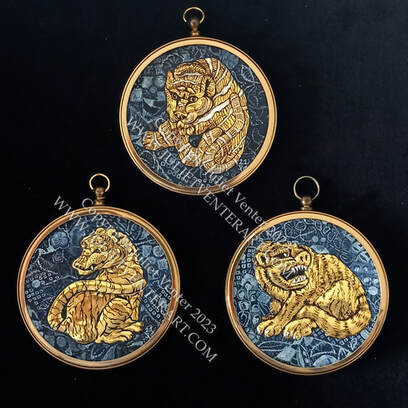
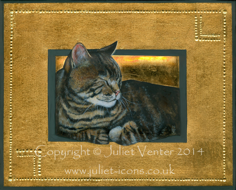
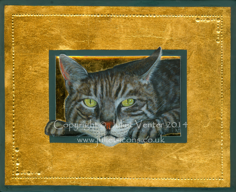
I rediscovered these little 'Netsuke Tigers' of mine at my daughter's place over Christmas, a birthday gift when she was going through an all-things-Japanese period. Inspired by some exquisite carved miniatures seen on-line, I somehow married the Japanese designs with a sort of western-style low relief and illuminator's gilding. I remember the first one was terribly awkward to do and by the the third I was quite in the swing. I'm not sure if I've struck on a new technique here or just painfully reinvented something old. Either way I'd like to take the idea a bit further but I'm not sure how - it's very time-consuming and one has to be a bit practical. Ideas, anyone?
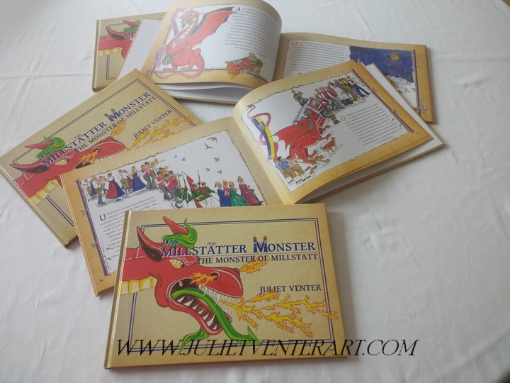
#raisedgilding #netsuke #miniaturepainting I need to boast about a monster achievement... I have been ignoring my blog for a long time, and here is one of the reasons why: my shiny new book just delivered ! I think this must be the first picture book illustrated in egg tempera since the Middle Ages. It is a bi-lingual story (English/German parallel text) for children of all ages. The Monster of Millstatt is a thirty-foot scarlet dragon who has been hibernating for a few hundred years in the mountains behind my house. When he finally emerges from his den he goes on the rampage and creates a load of comical trouble for the locals round the lake, till he is finally brought to heel and instated as a member of the community. The text and illustrations are all my own, though naturally I had a deal of help with the German. British humour is not easy to translate, it seems. The whole idea first grew out of a school cultural project frustrated by Corona restrictions. I thought it was a shame to waste a good idea, but it took over my life. I'm not a fast worker, and I quickly gave up counting the hundreds of hours spent on the pictures. Then when I realised that hiring a graphic designer to help with the layout was unaffordable, I had to set about learning all the software skills to do it myself. As for the printing, since I first approached printers for a quotation, costs have risen exponentially thanks to a world paper shortage. Reader, be warned! If ever the fancy should come over you to produce a book, have a little lie down and let the feeling wear off. Now comes the work of shipping 500 copies out of my cellar and on to the coffee tables of Carinthia - not a small task for a sales-shy artist operating in a foreign language. But I think that luckily the book has appeal both for locals and tourists - a souvenir with local flavour which is neither kitsch nor too heavy to pack in a suitcase. And the book has already been adopted as an event in the Millstatt Music Festival for next summer - a reading with musical interludes, along the lines of Peter & the Wolf, orTthe Carnival of the Animals. Local music director Stefan Hofer will compose the music:, and I am so looking forward to hearing what comes - my only stipulation was that he must include bagpipes and alpine horns, Fortunately he has both those instruments at his disposal. -Millstatt has everything.
Copies available direct from me at €20 each (order form here).
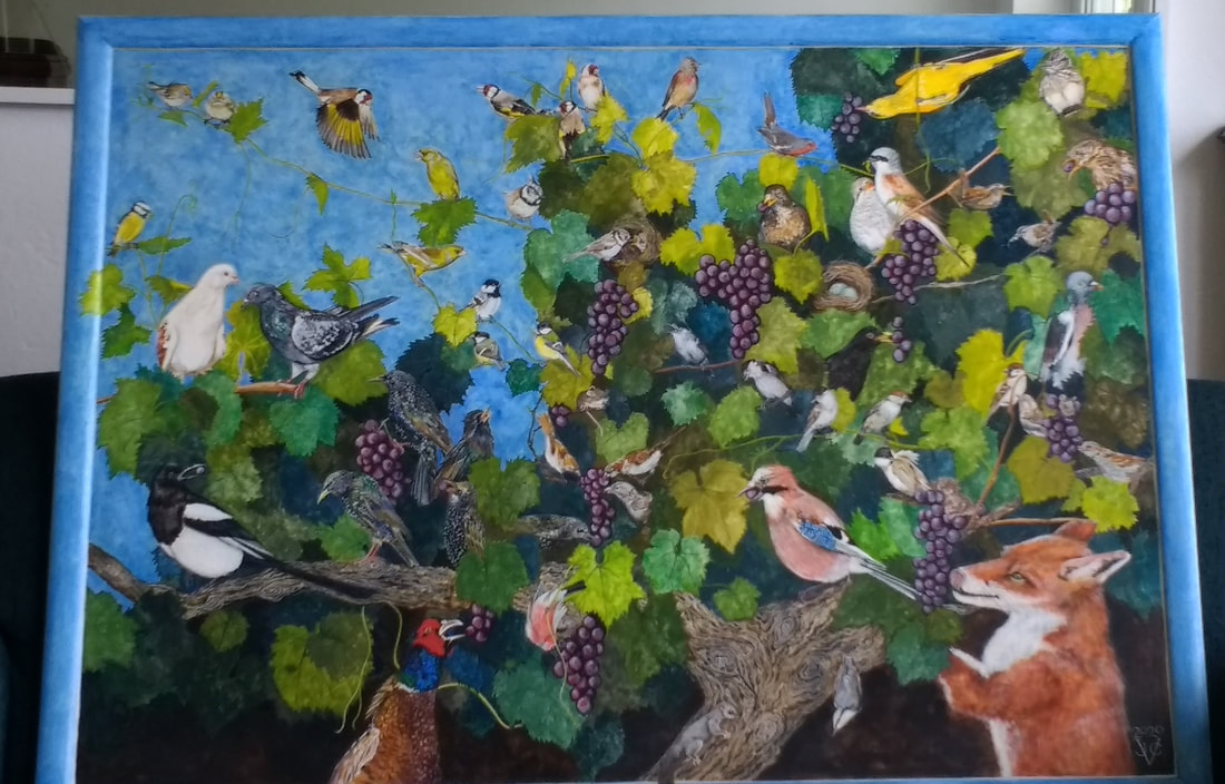
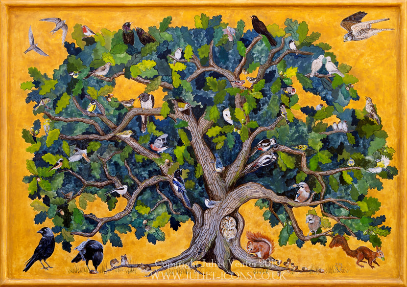
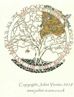
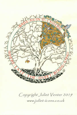
Other than the massive embroidered wall-hangings I used to make years ago, my work is generally pretty tiny. But I used all the lovely space I had during my artist residency earlier this year to paint something much bigger (120cm wide including the integral frame). And correspondingly more expensive of course, though as I painted every inch of the piece with my usual attention to detail, there weren't really any economies of scale - rather the reverse, in fact. I've had it hanging on my own wall while I dithered about it, but finally it's hanging 'on appro' in a client's office and hopefully growing on him. He's a bird watcher as well as an art collector, and tells me he has counted over fifty birds in the tree....
I'm considering getting some posters made of this image: if you have any technical wisdom on the subject of digital reproduction, please let me have the benefit of your experience!
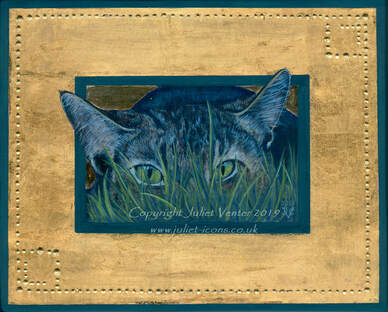 Moggy III: Stalker Moggy III: Stalker This is the slowest moving series in the history of art, but every so often I feel like painting a wonderful old tabby tom just like the one called Tim which my grandparents had years ago. This sneaky fellow stalking in the long grass is waiting for a frame. One of his former incarnations is in Australia now, where he can stalk more exotic prey than ever frequented my grandparents' suburban garden.
Oh taste and see, how gracious the Lord is. Just before Christmas truly begins, let me post this with all my kind wishes to friends and clients. I am offering special prayers this year for several who are suffering sad events amid all the festivities.
In recent decades we've seen a revival of interest in the devotional use of icons in the West, and I like to think that icons are doing more to bring about mutual understanding between Eastern and Western churches, and heal the great Schism of 1054, than a thousand years of conferences and theological debate. People are also experiencing a revived taste for the more austere artistic styles of the pre-Schism era. It is a valid argument that too much surface 'prettiness' is a distraction from the inner meaning and true purpose of the image. So human nature being as it is, debates over what constitutes a 'real' icon tend to rage, with combatants proclaiming one style spiritually superior to another according to their personal aesthetic and/or cultural bias. A cautious glance into the online discussion forums reveals furious verbal coshing about who should be permitted to paint icons and how, and much finger-wagging and invocation of church Canons about the making of them, None of these 'Canons' actually exist. Theologians of the early church discussed the use of the image, and certain conventions and guidelines have come down to us through tradition and painters' manuals, but no hierarch ever actually sat down and wrote a rule book. Whilst I have my own thoughts on the spirituality and practise of iconography, I love the words of St John of Shanghai and San Francisco (1896 - 1966) which I recently ran across: "I can pray in front of this kind of icon; I can pray in front of that kind of icon. The important thing is that we pray, not that we pride ourselves on having good icons."
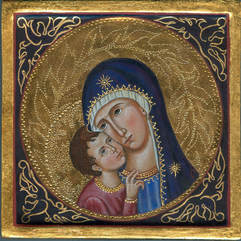
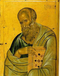
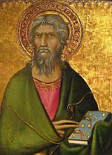
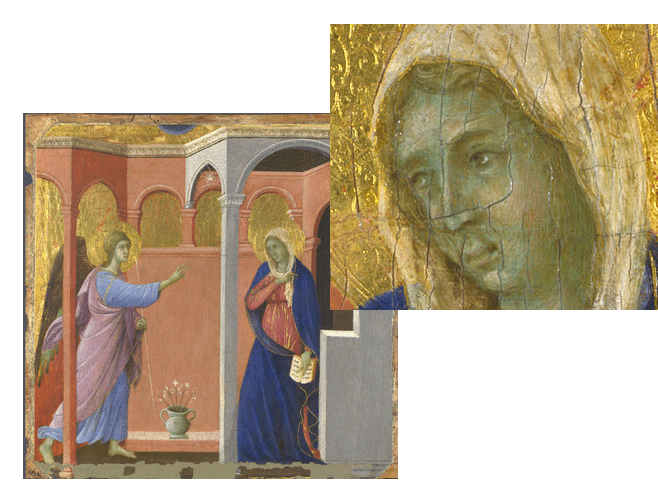
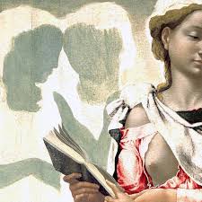
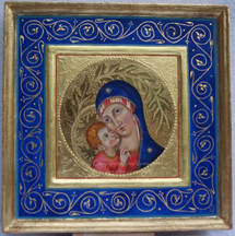
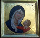
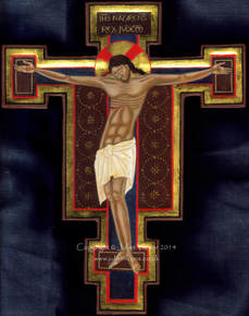
Another technical difference between the two styles is in the underpainting of the flesh. When painting in a 'Byzantine' style I shade the flesh with dark olive green, paint a tawny flesh tone over that topped by white highlights. The shading is less blended, the highlights often quite stylised. The effect also tends to be of a swarthier, mediterranean skin. In my 'Italianate' icons I shade with sepia and cover the flesh areas with a layer of cool green earth. Skin tones and highlights are painted over the green, and the effect is more of a paler, causcasian skin. This green underpainting of the flesh is very characteristic of medieval and Renaissance art: often the pink pigment used to put the roses in the face of the maddonna and angels has faded away leaving them looking a bit ill and anaemic. I wrote about this 'green sickness', and tooled gold work, in another blog post here. In short, when I say 'Italianate', I intend nothing more than to indicate an iconographic style which is very popular with some and anathema to others, without - I hope - offending either. I will continue to experiment in the style, although the labour for the elaborate gilding is immense and one cannot really charge for the time involved. So to finish with a little seasonal celebration, here are a few of the paintings I have labelled as Italianate or Sienese over the years. |
The view from my deskCurrent work, places and events, art travel, and interesting snippets about Christian icons, medieval art, manuscript illumination, egg tempera,, gilding, technique and materials. Categories
All
Archives
January 2024
|


 RSS Feed