In recent decades we've seen a revival of interest in the devotional use of icons in the West, and I like to think that icons are doing more to bring about mutual understanding between Eastern and Western churches, and heal the great Schism of 1054, than a thousand years of conferences and theological debate. People are also experiencing a revived taste for the more austere artistic styles of the pre-Schism era. It is a valid argument that too much surface 'prettiness' is a distraction from the inner meaning and true purpose of the image. So human nature being as it is, debates over what constitutes a 'real' icon tend to rage, with combatants proclaiming one style spiritually superior to another according to their personal aesthetic and/or cultural bias. A cautious glance into the online discussion forums reveals furious verbal coshing about who should be permitted to paint icons and how, and much finger-wagging and invocation of church Canons about the making of them, None of these 'Canons' actually exist. Theologians of the early church discussed the use of the image, and certain conventions and guidelines have come down to us through tradition and painters' manuals, but no hierarch ever actually sat down and wrote a rule book. Whilst I have my own thoughts on the spirituality and practise of iconography, I love the words of St John of Shanghai and San Francisco (1896 - 1966) which I recently ran across: "I can pray in front of this kind of icon; I can pray in front of that kind of icon. The important thing is that we pray, not that we pride ourselves on having good icons."
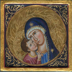
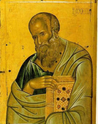
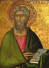
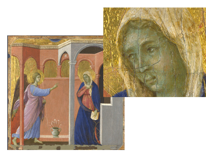
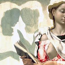
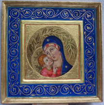
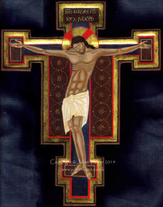
Another technical difference between the two styles is in the underpainting of the flesh. When painting in a 'Byzantine' style I shade the flesh with dark olive green, paint a tawny flesh tone over that topped by white highlights. The shading is less blended, the highlights often quite stylised. The effect also tends to be of a swarthier, mediterranean skin. In my 'Italianate' icons I shade with sepia and cover the flesh areas with a layer of cool green earth. Skin tones and highlights are painted over the green, and the effect is more of a paler, causcasian skin. This green underpainting of the flesh is very characteristic of medieval and Renaissance art: often the pink pigment used to put the roses in the face of the maddonna and angels has faded away leaving them looking a bit ill and anaemic. I wrote about this 'green sickness', and tooled gold work, in another blog post here. In short, when I say 'Italianate', I intend nothing more than to indicate an iconographic style which is very popular with some and anathema to others, without - I hope - offending either. I will continue to experiment in the style, although the labour for the elaborate gilding is immense and one cannot really charge for the time involved. So to finish with a little seasonal celebration, here are a few of the paintings I have labelled as Italianate or Sienese over the years. |
The view from my deskCurrent work, places and events, art travel, and interesting snippets about Christian icons, medieval art, manuscript illumination, egg tempera,, gilding, technique and materials. Categories
All
Archives
January 2024
|

 RSS Feed