|
This is the first painting to have left my desk for a long time, thanks to a big relocation (foreign country, foreign language, dilapidated house to renovate) which was accompanied by a surprise cancer diagnosis, with all the ensuing strains of seeking and undergoing treatment. It is so time-consuming to be ill! What better way to celebrate my ongoing recovery than with the completion of this unusual commission: the third Miracle at Cana icon I have painted for the same client, but this one a gift for his very special godson's forthcoming marriage. My client had very particular wishes for the overall design and colours, and has personalised the icon with the names of the bride and groom, and a blessing from John's gospel, all in Greek script. I had all the pleasure of wheeling out my best lapis lazuli and ordering a beautifully routed and cradled solid wood board from an artisan in Serbia.
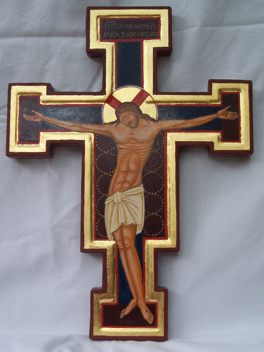 It's not often I find myself in the vanguard of business innovation, so I was really pleased to hear a discussion about the popularity and success of buying art over the web on BBC Radio 4 this morning. I started selling paintings from my website back in 2009 - I think this little crucifix (now somewhere on Orkney) was one of the first commissions I received by internet. I have always been surprised and delighted that people are prepared to buy something so personal as an artwork 'sight unseen'; though the ability to email a high resolution photographic scan is really helpful, and I haven't yet had a buyer ask to return a painting. And my experience is mirrored higher up the feeding chain - apparently on line sales of art have been increasing across the board, even in the four and five figure bracket, and with giants such as Sothebys and Christies.
This is a wonderful thing for artists because, provided one can get to grips with the intricacies of on line marketing, it opens the world up for sales and liberates us from selling solely through brick-and-mortar galleries. People are always shocked to hear that an art gallery generally takes 50% of the sale price of a piece, plus VAT on top of that. In London that fee would often be 60% or 70%. Rent and rates on high street premises, glossy brochures and travelling to art fairs and functions all costs a great deal of money even before the gallery's staff costs are paid. It is very hard for a gallery owner to make a living. Unfortunately it is even harder for an artist. To make more than five pence an hour painting an original, an artist's work must command a very good price indeed, involving years spent slowly building a 'name' and nudging up ones prices. A gallery's commission is only the start of the expenses involved in selling. The artist bears the cost of professional framing - if you have ever had a print framed, you will know how expensive that can be. A gallery takes work 'on consignment' - that is to say, the artist is paid nothing for it until it sells, if at all. Often an artist has to pay an up-front annual fee for wall space before the gallery will actively market the work. As a result, many galleries are stocked largely with prints or cheerful-looking canvasses with rorschach blobs and splashes. So dear reader, if you are buying art for your home and want something really original and unique I urge you to become a patron of the arts. Hunt down the artist's website and approach them directly. No prices displayed? It costs nothing to ask!
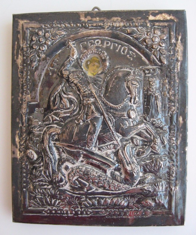
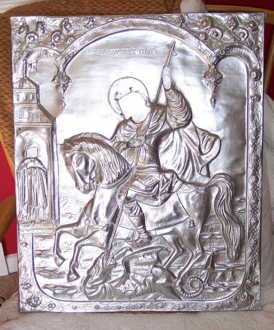
I am also currently working on the restoration of a big St George icon (dragon and princess this time) a project which I took on in a fit of rash enthusiasm and which I don't mind admitting is giving me a packet of trouble. Fortunately (as I am not a conservator) it is worth nothing either artistically or monetarily: it has sentimental value to the owner, who found it in a junk yard sale, because it reminds him of his Serbian heritage. It is a curious item: it seems to have been cast in resin from the riza on some old icon, complete with nail heads and tack holes. A riza (sometimes oklad, Russian) or revetment is an embossed metal cover made to protect a precious icon from candle smoke and the kisses of the faithful. The embossing echoes the painted design underneath and only the hands and faces of the saint peep out from the cover. I found some examples on line - one a 19th century version in plaster, and another which is copyright. This copy had been sprayed gold and paper prints of faces and hands pasted on the top. A few damp years in a garage, and they had peeled off completely. I am trying to replace them with something a little worthier than paper cut-outs, using gesso on balsa wood and a great deal of ingenuity. St George has also had a respray, silver this time at the client's request, and now he looks like the King of Bling. I can recommend Plasticote Brilliant Metallic spray paints, they really are remarkably convincing. Courtauld Institute standards it is not, but I hope to turn it into something the client wants to hang in his home. Look back in a while for the faces. And before anyone else asks - no, I do not do restorations.
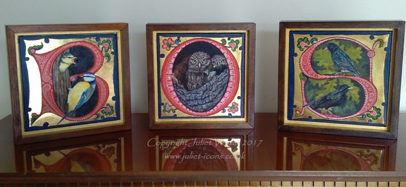 Some new bird-in-letter pieces for the new season. They will be sold individually, which is just as well because I see if I switch them around they will spell 'SOB', which was not what I intended...
The window as a whole is very large and elaborate in conception, and there are more expensive stained glass windows lining the nave, though Troutbeck is such a tiny place you could blink and miss it - Troutspeck, even. I guess the grandees who commissioned the many fabulous Arts and Crafts or neo-gothic holiday palaces in those parts were gracious enough to share some of their worldly excess with the local yokels who joined them for worship in these little village churches. 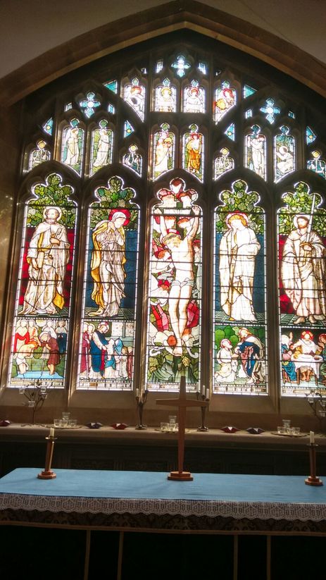
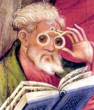
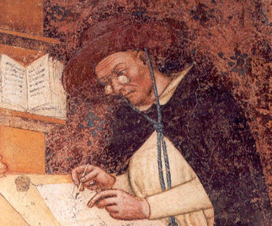
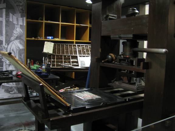
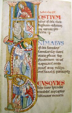
I don't think the effects of myopia - or even astigmatism or cataracts - on a person's life have been given proper credit by art historians. Most illuminated manuscripts have details so tiny that the artist must have had magnifiers or have been naturally shortsighted to paint such tiny detail so perfectly: reproductions in books tend to be enlarged so one doesn't get a true impression of how tiny they were. I've always been very short-sighted myself, and when I take off my glasses I can see in glorious magnification provided I have my work no more than an inch from my face. Anything further away is a miasmal mist, so that I have to line up my pigment pots in a special order and locate them by feel. I am exploiting my own weakness by choosing to paint small, but if I wanted to go larger it would have to be as a latter-day misty Impressionist or a new Jackson Pollock. Easel painting would mean constantly juggling with three sets of eyewear. Getting back to Gutenberg and his printing press, the Museum was very empty when I visited so I was lucky enough to get a turn printing a page of St John's gospel on his very machine. So exciting! The machine actually started out life as a wine press, which Gutenberg adapted to the purpose. An incredibly heavy contraption to turn- his assistants must have been a brawny bunch.
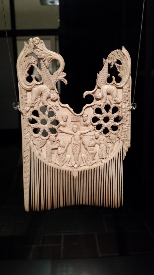
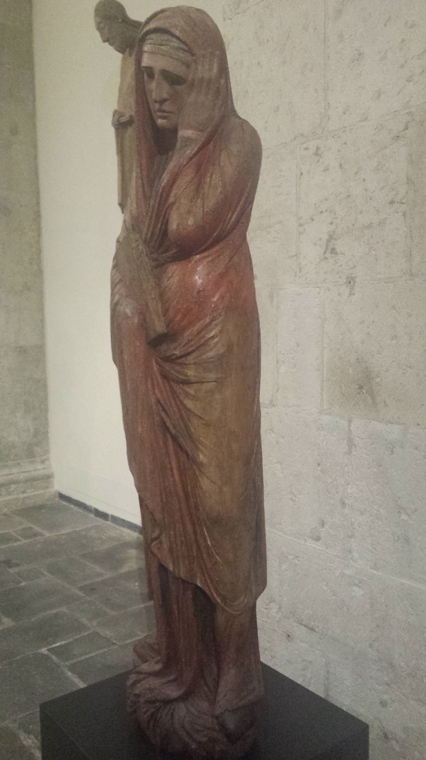
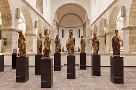
 Romanesque church of St Caecilia, Cologne. Now the Schnuetgen Museum of Medieval Art Romanesque church of St Caecilia, Cologne. Now the Schnuetgen Museum of Medieval Art ermany has a tradition of carved religious statuary unbroken from the early middle ages, so was not surprised that this art form dominated the lovely Schuetgen Museum in Cologne: it is a private collection, donated to the city, and perfectly housed in Romanesque church building. I had the place almost to myself, and could walk round all the exhibits and examine them from near and far to my heart's content, only slightly inhibited by the hovering of the museum guardian who, having no one else to keep an eye on, and presumably having long since exhausted the novelty of the exhibits, trailed me round like my own personal minder. I remarked hintfully that he must find the work very dull but he shrugged and said, "Ein Job ist ein Job". Looking over the photographs I took, I feel provoked to get on the soapbox for one of my rants. Will somebody please tell me how in the world we got from this:-
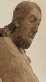
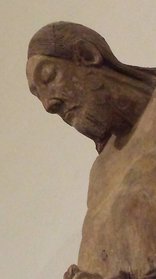
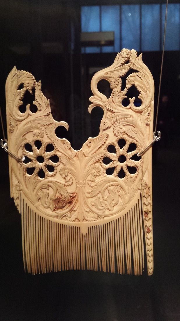
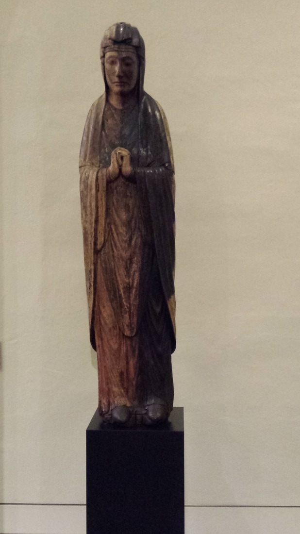
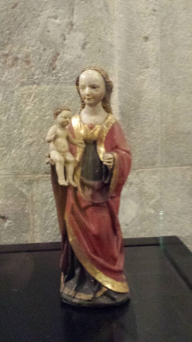
A 12th C carved wooden corpus (polychrome, but paint now eroded) in Schnuetgen Museum Cologne. - to this? - And this?
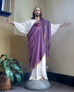
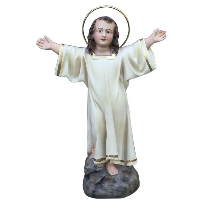
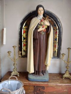
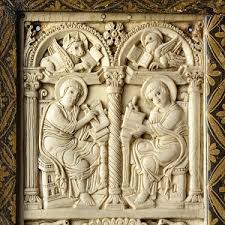
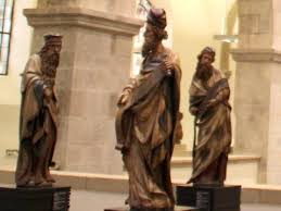
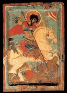
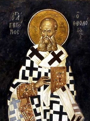
The local talentPeople, have we all gone blind? Is this a proper focus for prayer and meditation? Why are we confronted every Sunday by this kind of ubiquitous glassy-eyed tat? Is it because The Committee would rather buy something out of a supplier's catalogue than risk dealing with a real live artist? There are people who make a living out of restoring these plaster statues - it shouldn't be allowed! When I am dictator of the world we will consign all the hideous pious paraphernalia to the cemetery and commssion some real artists. Even if it's not world class it will surely be more honest and expressive than what we've got now. There is a Facebook Group entitled "I'm fed up with bad church music". I propose a sister act entitled "We're sick of tacky church art", I have worked myself up into such a passion now that I can only append, without further invidious comparison, a sample of the other magnificent Christian art on display at the Schnutgen Museum.
Recently a family member asked me to provide some artwork for the cover of a forthcoming book, which besides being my first opportunity at a project of this kind presented some interesting technical problems. Gold areas in a design are notoriously difficult to reproduce in print. Every scratch and blemish is magnified in a scan, it comes out looking dull and brown, or gives off unwanted reflections. I decided it would be a waste to include any gold in the design at all. Not that lack cheapens the piece as an icon in any way. In the past, icon painters by no means always used gold in their designs. In times of scarcity or of war, for fresco schemes, for clients with shallower pockets, or sometimes simply for artistic reasons, many icons were painted with coloured backgrounds.
Putting aside its symbolical properties, burnished gold acts as neutral in a painting (strangely enough) and also, as a background, makes a motif 'tell up' incredibly well. Also, let's be honest, that amount of bling tends to distract from a multitude of shortcomings in a painting. Icon painters can tend to get very hung up on the quality of their gilding and devote less time to improving the actual painting!
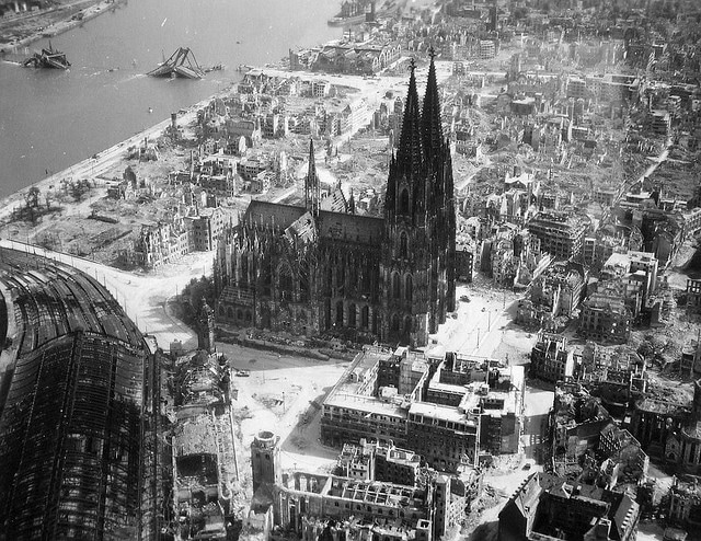
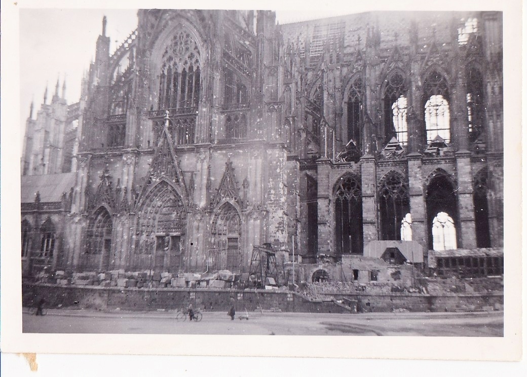
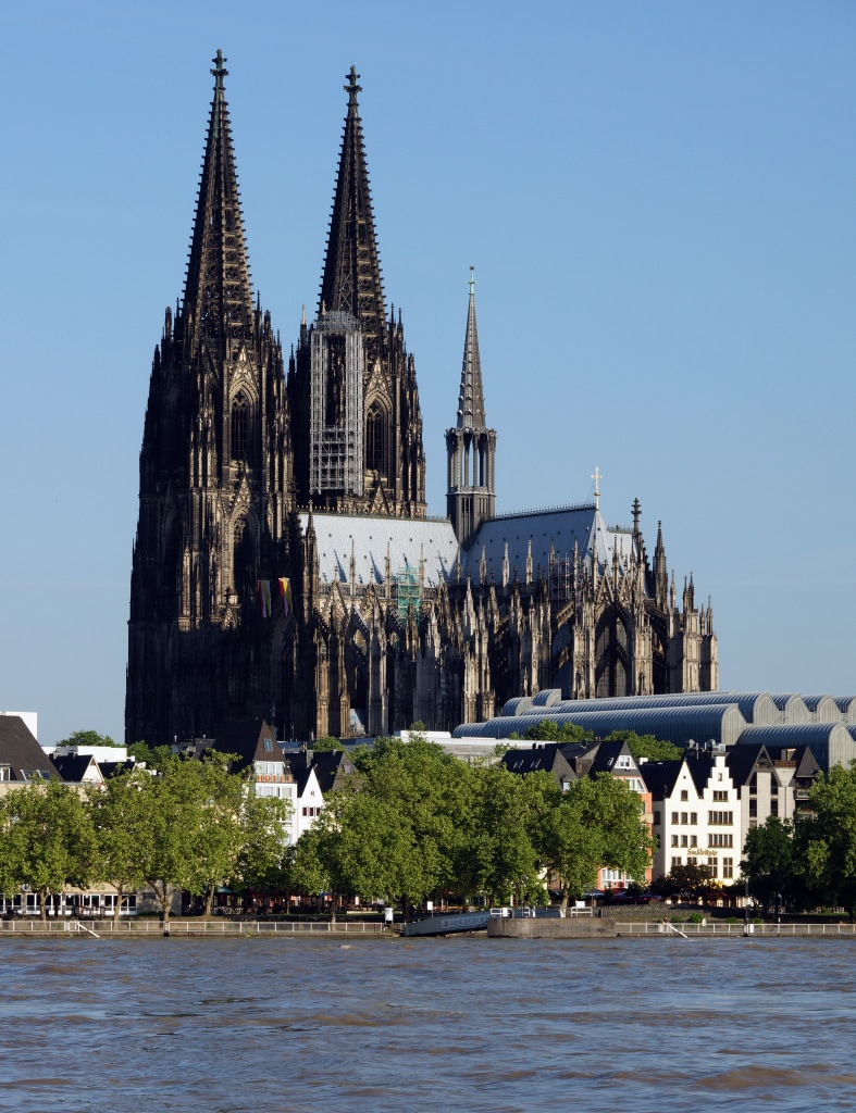
In the end I substituted a painted ground of red for the the medallion of Christ. I added the symbols of the four gospellers afterwards, to complete the piece as an icon, and used brilliant white for the background. White is used in icons to convey the brilliance of uncreated light (think of Christ's robes in icons of the Transfiguration). I would have made life a great deal easier for myself if I had not glazed the red with transparent quinacridone pigment to warm its tone - forgetting that quinacridone is horribly staining and travels everywhere, especially onto pure white backgrounds! The quinacridones are a new addition to the artist's palette, developed by the car industry I am told, and useful as a substitute for carmine and alizarin, which are of suspect lightfastness. It's just too darn messy, though; I think I shall have to retire it from my arsenal. An icon of Christ the Teacher in combination with the Hindu and Buddhist lotus symbol were specifically requested by the author to tie in with the theme of the book, which is a work of comparative theology. I designed the roundel of Christ to appear within the 'O' of the book title, with the eastern lotus symbol and frieze beneath, though no doubt the publisher will rehash my design to his own taste. I believe the book goes to print quite shortly: publisher James Clarke & Co Ltd. The actual icon will be framed (unusual for me, but for purposes of reproduction the board was a lightweight one), and appear for sale on my website in due course.  As a child visiting my grandparents, I used to love poring over their twelve volumes of Arthur Mee's Children's Encyclopedia. A wonderful work, in print for an incredible sixty years from the early 1900s! Among the many anachronistic treasures to be found therein were photographs of the great North European cathedrals taken before the terrible destruction visited on so many of them during the second world war. I had them in mind on my recent visit to Cologne in Germany, home of the famous Koelnisch Wasser ('4711' as it's known - my grandmother had a covetably dinky little bottle of it sitting on her dressing table). Cologne, always important for its strategic trading position on the Rhine, is now a modernised industrial city famous for its crazy Easter carnival which lasts six months and for having being bombed to blazes during the war. But happily there are some surviving golden nuggets for the medieval art enthusiast to mine. Most well-known of them is the cathedral, whose blackened twin towers rise into the sky as a testament to the Koelner tenacity and determination to rebuild it from the ruins. The citizens set about the task of rebuilding almost immediately after the war, and work continues to this day.
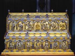
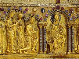
The cathedral houses a magnificent golden shrine to the Magi whose reputed mortal remains have been here since the early twelfth century. I wish I could have got closer to the reliquary, because it is an artwork almost worthy of reverence in itself, made by the incomparable medieval goldsmith Nicholas of Verdun. Instead I lit a candle for a precious family friend whose death we heard of while we were away, and thought of the beautiful Poulenc motet he and I used to sing in the church choir, 'Videntes stellam': teeth-jarringly beautiful dissonances in the second soprano line. "Seeing the star, the wise men were overwhelmed with great joy;and entering the dwelling, they offered to the Lord gold, frankincense, and myrrh.
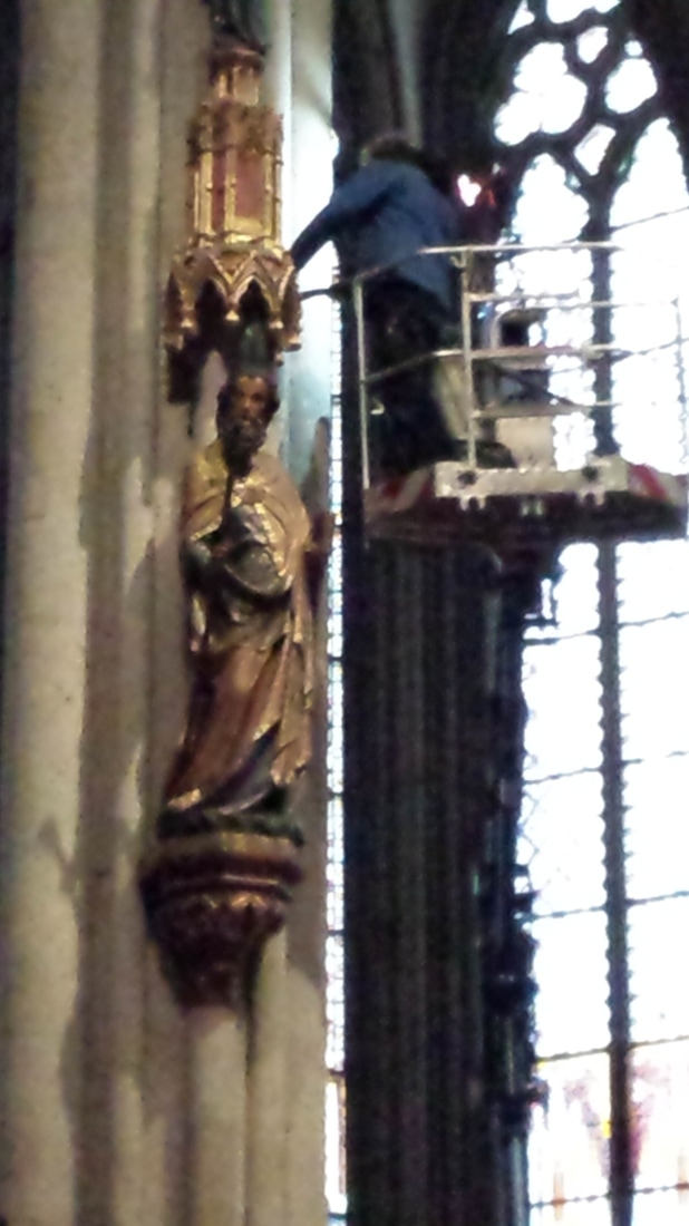
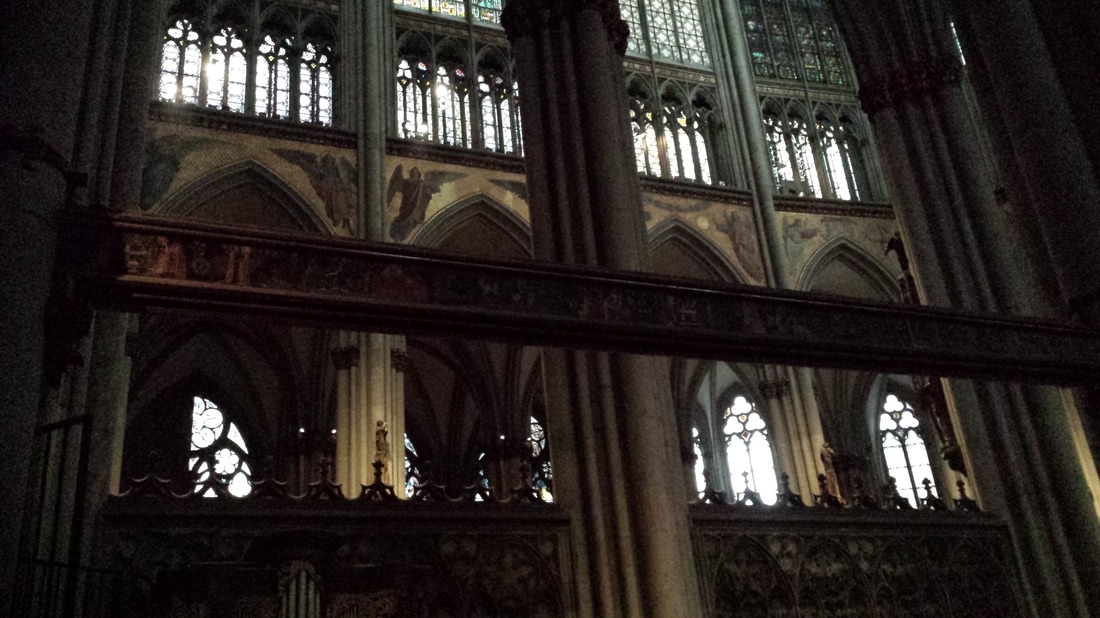
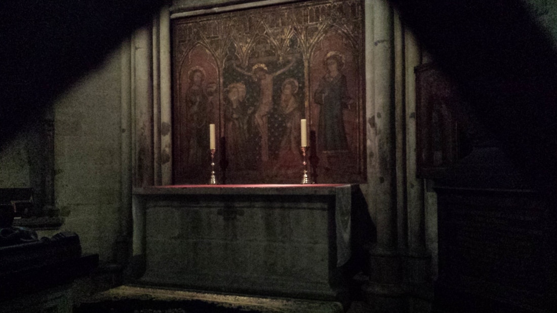
The day of my visit a great deal of noisy pavement construction was going on, and the ambulatory was occupied by a mini-crane with a woman bravely perched thirty or forty feet up in the bucket, dusting a polychrome archbishop with paint brush and vacuum. She noticed me taking the photograph and shot me an old-fashioned look, which is my excuse for the lack of focus. Unfortunately most of my pictures of the interior were either too blurred or too dark to be worth publishing. The second photo below was intended to show the interesting painted gothic beam, looking as if it were originally part of a rood screen - but instead the modern mosaics below the clerestory show up much better. The third grainy photo is of a painted stone side altar which caught my eye, partly for the green and red colour interchange which I love so much and seems so characteristic of gothic art.
Also in Cologne I found the Schnuetgen Museum, a cave of medieval treasures - more to follow soon!
|

The view from my deskCurrent work, places and events, art travel, and interesting snippets about Christian icons, medieval art, manuscript illumination, egg tempera,, gilding, technique and materials. Categories
All
Archives
January 2024
|


 RSS Feed