|
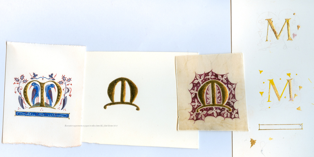
Recently I have been experimenting with various surfaces for illuminated miniatures and with different recipes for illuminator's raised gesso. In the longer term I am looking for an alternative support to hefty gesso boards for icon work, but for all those interested in manuscript illumination here are some working notes which may be useful. These little initial Ms (about an inch high) are each on a different surface and with different gesso mixes under the gold.
The M with birds first from the left is on Arches 300gsm hot press watercolour paper, a bit fibrous to work with and as with any paper, mistakes can't be lifted. The gesso under the gold was my first ever batch which I stupidly tinted with cadmium yellow, wanting a more golden colour to it than the usual armenian bole gives. I suspect the cadmium pigment, having sulphur in it, will argue with the lead white in the mix, causing it to blacken. No 2 in the middle is on Fabriano 600gsm watercolour paper (more like card in thickness and so not prone to buckling when one paints). This I surface-sized with a traditional gelatine/alum mix, to help subdue any surface fibres. This worked, but since alum is acidic I wonder if it is a good idea even in such low concentrations. Fabriano papers anyway seem much pleasanter and smoother to work on than Arches to my mind. The gesso in this letter was a new batch I made up, no cadmium this time, and burnished well. I will paint in a design at some point Sample 3 was my first ever attempt on vellum: I've bought sample offcuts of Kelmscott, Classic and Natural vellum and this was a piece of the Natural. I love the veining and buff colour. It was quite slick to work on - needed a dry brush and some patience to build up the paint surface, and it might have been easier if I had pounced the surface very lightly first. My more experienced friend Caroline counsels against pounce though, saying it is only for calligraphy - subject for another day's experiment. The leaf design was adapted from the Luttrell Psalter. The last two Latin Ms are two abandoned tests - the top M was a gesso which had insufficient glue in it. All the huffing and puffing in the world wouldn't get the gold to stick properly and I had to reconstitute the remaining tablets and add some seccotine. The second letter was partly done with Roberson's bright yellow 'Improved Gold Body', which I thought was rubbish: neither good adhesion nor good burnishing. If this is the improved version the original must have been very bad indeed. I tried doing the right hand upright (showing pink) with a gesso recipe I picked off the web using titanium dioxide in the mix instead of lead white. As Titanium does not have the plasticising qualities of the lead white, it does not burnish beautifully but I thought the results were acceptable for a small project where one might want to avoid poisonous materials. I used the same mix to make a greetings card for a friend who was very ill. |
The view from my deskCurrent work, places and events, art travel, and interesting snippets about Christian icons, medieval art, manuscript illumination, egg tempera,, gilding, technique and materials. Categories
All
Archives
January 2024
|


 RSS Feed