|
This is the first painting to have left my desk for a long time, thanks to a big relocation (foreign country, foreign language, dilapidated house to renovate) which was accompanied by a surprise cancer diagnosis, with all the ensuing strains of seeking and undergoing treatment. It is so time-consuming to be ill! What better way to celebrate my ongoing recovery than with the completion of this unusual commission: the third Miracle at Cana icon I have painted for the same client, but this one a gift for his very special godson's forthcoming marriage. My client had very particular wishes for the overall design and colours, and has personalised the icon with the names of the bride and groom, and a blessing from John's gospel, all in Greek script. I had all the pleasure of wheeling out my best lapis lazuli and ordering a beautifully routed and cradled solid wood board from an artisan in Serbia.
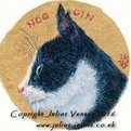
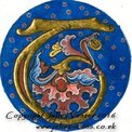
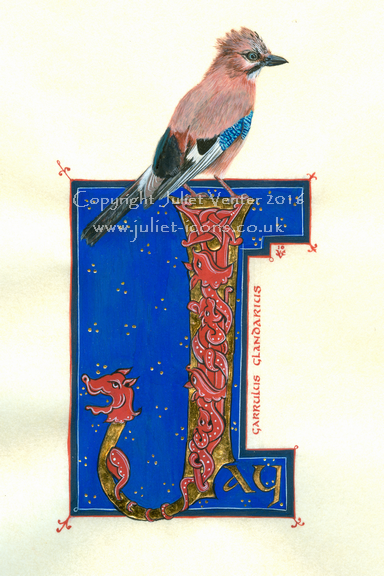
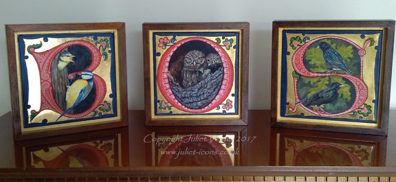 Some new bird-in-letter pieces for the new season. They will be sold individually, which is just as well because I see if I switch them around they will spell 'SOB', which was not what I intended...
Recently a family member asked me to provide some artwork for the cover of a forthcoming book, which besides being my first opportunity at a project of this kind presented some interesting technical problems. Gold areas in a design are notoriously difficult to reproduce in print. Every scratch and blemish is magnified in a scan, it comes out looking dull and brown, or gives off unwanted reflections. I decided it would be a waste to include any gold in the design at all. Not that lack cheapens the piece as an icon in any way. In the past, icon painters by no means always used gold in their designs. In times of scarcity or of war, for fresco schemes, for clients with shallower pockets, or sometimes simply for artistic reasons, many icons were painted with coloured backgrounds.
Putting aside its symbolical properties, burnished gold acts as neutral in a painting (strangely enough) and also, as a background, makes a motif 'tell up' incredibly well. Also, let's be honest, that amount of bling tends to distract from a multitude of shortcomings in a painting. Icon painters can tend to get very hung up on the quality of their gilding and devote less time to improving the actual painting!
In the end I substituted a painted ground of red for the the medallion of Christ. I added the symbols of the four gospellers afterwards, to complete the piece as an icon, and used brilliant white for the background. White is used in icons to convey the brilliance of uncreated light (think of Christ's robes in icons of the Transfiguration). I would have made life a great deal easier for myself if I had not glazed the red with transparent quinacridone pigment to warm its tone - forgetting that quinacridone is horribly staining and travels everywhere, especially onto pure white backgrounds! The quinacridones are a new addition to the artist's palette, developed by the car industry I am told, and useful as a substitute for carmine and alizarin, which are of suspect lightfastness. It's just too darn messy, though; I think I shall have to retire it from my arsenal. An icon of Christ the Teacher in combination with the Hindu and Buddhist lotus symbol were specifically requested by the author to tie in with the theme of the book, which is a work of comparative theology. I designed the roundel of Christ to appear within the 'O' of the book title, with the eastern lotus symbol and frieze beneath, though no doubt the publisher will rehash my design to his own taste. I believe the book goes to print quite shortly: publisher James Clarke & Co Ltd. The actual icon will be framed (unusual for me, but for purposes of reproduction the board was a lightweight one), and appear for sale on my website in due course.
Gold is yellow, right? Well not really: some golds are more yellow than others. The two icons of St Francis above are looking like one of those 'spot the difference' puzzles we used to get as children, but the chief difference - the colour of the gold leaf I used in each - is not at all obvious on the screen. When you go to buy a book of gold leaf - generally from an on-line supplier - the array of golds on offer is completely bewildering. Bog standard 'yellow' gold can be 24, 23 or 22 carat, extra thick, double thick or regular, and each differs slightly in its tone. Not enough difference to read on a computer screen perhaps, but very obvious if you accidentally mix them up on the same painting (yep, been there!). Then there's Italian gold, German ducate, moon gold, red gold, lemon gold, green gold, champagne gold, white gold - the computer screen doesn't give one a very good idea of the differences and sample books are very expensive. The different colours are determined by the quantity and type of alloy metals in the leaf - silver, copper, nickel etc. 24ct gold, being pure, is a rich yellow colour; 22ct tends to be slightly more silvery. Some gold leaf has more of a crinkly texture, which you may or may not like. The presence of copper in the mix makes the leaf appear pinker (one sees this reddier tone clearly in gold jewellery made in India, for example).
So how to choose? Well, anything below 22ct is likely to tarnish fairly quickly, so is best avoided for work that you want to last: that instantly eliminates quite a number of options offered by the goldbeater. 24ct gold is more malleable and does not tarnish at all, so is chosen for 'best work' and for anything that will be exposed to the outside air. It is softer and therefore show the joins between leaves less after burnishing. Using 'double' or 'extra thick' gold leaf may mean you can avoid double gilding, which is generally necessary in order to get a good finish with standard thickness leaf: it is more expensive than standard thickness, so you will have to calculate whether with luck and skill you will make a saving or end up having to double gild anyway! For work intended to stay indoors, so less exposed to atmospheric pollution, 22 ct is adequate and perhaps a little easier to handle on the cutting pad. Beyond those parameters, you can let your choice be dictated by personal taste and price. The second of my St Francis icons (dated 2017) was made with 23 ct red gold, which I bought this time for no better reason than that it was older stock being offered at the old price. I like the way its warmer tone sits with the reds and browns of the icon - I have yet to decide whether it will sit comfortably in other pieces.
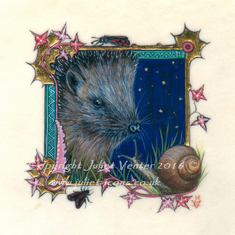
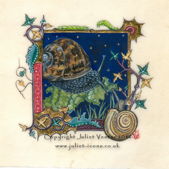
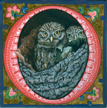
Not just for Christmas, of course. It's that time of year again when the galleries are preparing for their pre-Christmas private viewings and smaller paintings which will make good gifts are in high demand. For Norton Way Gallery in Letchworth I have painted a whole range of creatures great and small, including some more in my 'Night in the Garden' series of illuminations on vellum about which I have posted previously. I'm running behind as ever, and there are several starlings, a number of saints and a Nativity illumination unfinished on my desk...
I have had these two gentlemen on my desk ever since my pilgrimage to the medieval Spanish art at MNAC in Barcelona back in February, and mounted them to my sale page last night thinking they were finished at last - until my dear husband pointed out that I have neglected to paint the white highlights on one of them. Not varnished yet, fortunately, so I can correct the omission. The florid borders, a departure for me, are a homage to a Spanish altarpiece I studied and a reference to the origins of the great saint and his brave disciple. We used to recite St Ignatius' prayer in assembly at my junior school nearly half a hundred years ago: a surprising choice, given that it was not in any way a religious foundation, never mind Catholic. Teach us, good Lord, to serve you as you deserve; to give and not to count the cost; to fight and not to heed the wounds; to toil and not to seek for rest...... The words always inspired a certain inward terror of the martyr's steely determination. My best friend began a fascination which led him to become a Jesuit himself, and for reasons entirely personal I named my own son Xavier. St Ignatius endures, but last time I passed by the school it had been razed to the ground.
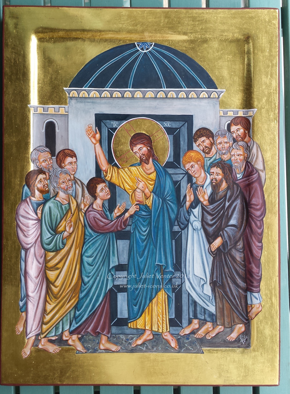 Continuingl on a cheery note, I managed to get my icon of the Confession of Thomas finished before disappearing on holiday for my own micro-Brexit. Slightly under A3 this, so quite large for me, but all those little figures - the festival icons always leave me wondering whether it was strictly necessary to have so many apostles. I suppose I should be glad it wasn't the 70 Martyrs of Sebastopol. No inscription yet - we are still mulling it over. Confession? Declaration? Convincing? Testing? I talked it over in my previous blog entry here. Feel free to express preferences or make suggestions.
|

The view from my deskCurrent work, places and events, art travel, and interesting snippets about Christian icons, medieval art, manuscript illumination, egg tempera,, gilding, technique and materials. Categories
All
Archives
January 2024
|


 RSS Feed