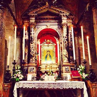
This is the first painting to have left my desk for a long time, thanks to a big relocation (foreign country, foreign language, dilapidated house to renovate) which was accompanied by a surprise cancer diagnosis, with all the ensuing strains of seeking and undergoing treatment. It is so time-consuming to be ill! What better way to celebrate my ongoing recovery than with the completion of this unusual commission: the third Miracle at Cana icon I have painted for the same client, but this one a gift for his very special godson's forthcoming marriage. My client had very particular wishes for the overall design and colours, and has personalised the icon with the names of the bride and groom, and a blessing from John's gospel, all in Greek script. I had all the pleasure of wheeling out my best lapis lazuli and ordering a beautifully routed and cradled solid wood board from an artisan in Serbia.
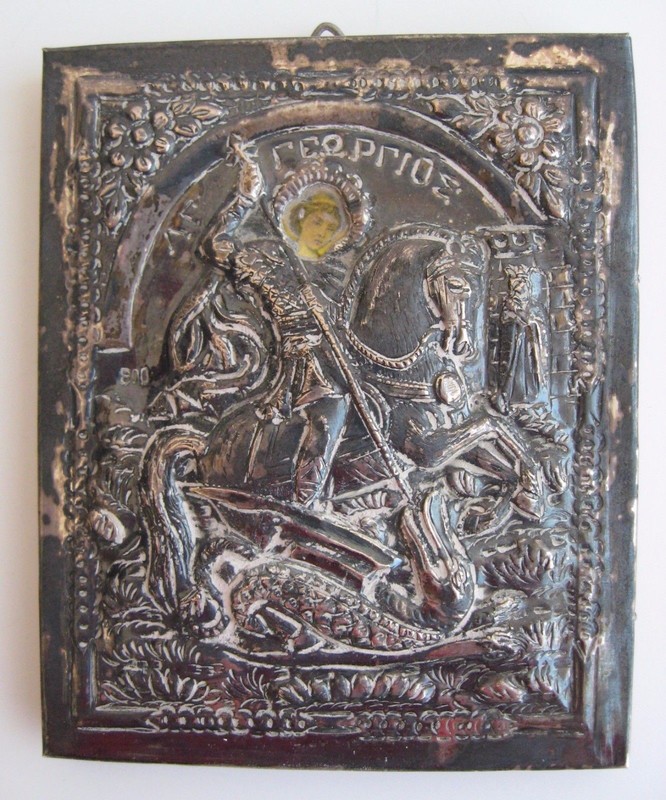
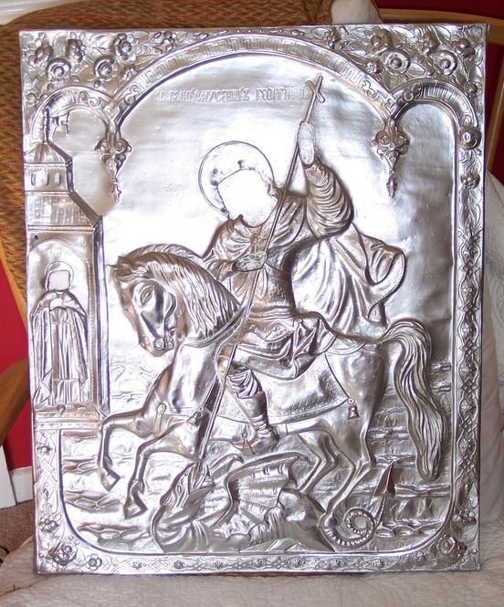
I am also currently working on the restoration of a big St George icon (dragon and princess this time) a project which I took on in a fit of rash enthusiasm and which I don't mind admitting is giving me a packet of trouble. Fortunately (as I am not a conservator) it is worth nothing either artistically or monetarily: it has sentimental value to the owner, who found it in a junk yard sale, because it reminds him of his Serbian heritage. It is a curious item: it seems to have been cast in resin from the riza on some old icon, complete with nail heads and tack holes. A riza (sometimes oklad, Russian) or revetment is an embossed metal cover made to protect a precious icon from candle smoke and the kisses of the faithful. The embossing echoes the painted design underneath and only the hands and faces of the saint peep out from the cover. I found some examples on line - one a 19th century version in plaster, and another which is copyright. This copy had been sprayed gold and paper prints of faces and hands pasted on the top. A few damp years in a garage, and they had peeled off completely. I am trying to replace them with something a little worthier than paper cut-outs, using gesso on balsa wood and a great deal of ingenuity. St George has also had a respray, silver this time at the client's request, and now he looks like the King of Bling. I can recommend Plasticote Brilliant Metallic spray paints, they really are remarkably convincing. Courtauld Institute standards it is not, but I hope to turn it into something the client wants to hang in his home. Look back in a while for the faces. And before anyone else asks - no, I do not do restorations.
Recently a family member asked me to provide some artwork for the cover of a forthcoming book, which besides being my first opportunity at a project of this kind presented some interesting technical problems. Gold areas in a design are notoriously difficult to reproduce in print. Every scratch and blemish is magnified in a scan, it comes out looking dull and brown, or gives off unwanted reflections. I decided it would be a waste to include any gold in the design at all. Not that lack cheapens the piece as an icon in any way. In the past, icon painters by no means always used gold in their designs. In times of scarcity or of war, for fresco schemes, for clients with shallower pockets, or sometimes simply for artistic reasons, many icons were painted with coloured backgrounds.
Putting aside its symbolical properties, burnished gold acts as neutral in a painting (strangely enough) and also, as a background, makes a motif 'tell up' incredibly well. Also, let's be honest, that amount of bling tends to distract from a multitude of shortcomings in a painting. Icon painters can tend to get very hung up on the quality of their gilding and devote less time to improving the actual painting!
In the end I substituted a painted ground of red for the the medallion of Christ. I added the symbols of the four gospellers afterwards, to complete the piece as an icon, and used brilliant white for the background. White is used in icons to convey the brilliance of uncreated light (think of Christ's robes in icons of the Transfiguration). I would have made life a great deal easier for myself if I had not glazed the red with transparent quinacridone pigment to warm its tone - forgetting that quinacridone is horribly staining and travels everywhere, especially onto pure white backgrounds! The quinacridones are a new addition to the artist's palette, developed by the car industry I am told, and useful as a substitute for carmine and alizarin, which are of suspect lightfastness. It's just too darn messy, though; I think I shall have to retire it from my arsenal. An icon of Christ the Teacher in combination with the Hindu and Buddhist lotus symbol were specifically requested by the author to tie in with the theme of the book, which is a work of comparative theology. I designed the roundel of Christ to appear within the 'O' of the book title, with the eastern lotus symbol and frieze beneath, though no doubt the publisher will rehash my design to his own taste. I believe the book goes to print quite shortly: publisher James Clarke & Co Ltd. The actual icon will be framed (unusual for me, but for purposes of reproduction the board was a lightweight one), and appear for sale on my website in due course.
Gold is yellow, right? Well not really: some golds are more yellow than others. The two icons of St Francis above are looking like one of those 'spot the difference' puzzles we used to get as children, but the chief difference - the colour of the gold leaf I used in each - is not at all obvious on the screen. When you go to buy a book of gold leaf - generally from an on-line supplier - the array of golds on offer is completely bewildering. Bog standard 'yellow' gold can be 24, 23 or 22 carat, extra thick, double thick or regular, and each differs slightly in its tone. Not enough difference to read on a computer screen perhaps, but very obvious if you accidentally mix them up on the same painting (yep, been there!). Then there's Italian gold, German ducate, moon gold, red gold, lemon gold, green gold, champagne gold, white gold - the computer screen doesn't give one a very good idea of the differences and sample books are very expensive. The different colours are determined by the quantity and type of alloy metals in the leaf - silver, copper, nickel etc. 24ct gold, being pure, is a rich yellow colour; 22ct tends to be slightly more silvery. Some gold leaf has more of a crinkly texture, which you may or may not like. The presence of copper in the mix makes the leaf appear pinker (one sees this reddier tone clearly in gold jewellery made in India, for example).
So how to choose? Well, anything below 22ct is likely to tarnish fairly quickly, so is best avoided for work that you want to last: that instantly eliminates quite a number of options offered by the goldbeater. 24ct gold is more malleable and does not tarnish at all, so is chosen for 'best work' and for anything that will be exposed to the outside air. It is softer and therefore show the joins between leaves less after burnishing. Using 'double' or 'extra thick' gold leaf may mean you can avoid double gilding, which is generally necessary in order to get a good finish with standard thickness leaf: it is more expensive than standard thickness, so you will have to calculate whether with luck and skill you will make a saving or end up having to double gild anyway! For work intended to stay indoors, so less exposed to atmospheric pollution, 22 ct is adequate and perhaps a little easier to handle on the cutting pad. Beyond those parameters, you can let your choice be dictated by personal taste and price. The second of my St Francis icons (dated 2017) was made with 23 ct red gold, which I bought this time for no better reason than that it was older stock being offered at the old price. I like the way its warmer tone sits with the reds and browns of the icon - I have yet to decide whether it will sit comfortably in other pieces. 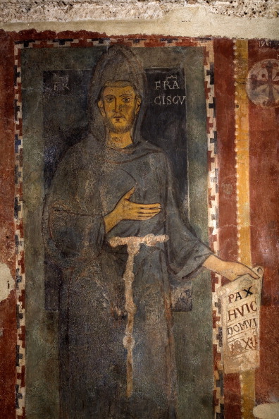 St Francis Fresco, Subiaco Monastery St Francis Fresco, Subiaco Monastery Yesterday we woke up to the news that Norcia in Italy has again been hit by an earthquake. Thankfully this time there seem to be no human casualties, but word is that the ancient Benedictine monastery of Subiaco has suffered bad damage. I wonder how its famous fresco of St Francis has fared? It's thought that it must have been painted when Francis was still alive (on earth, that is) because it is inscribed 'Brother Francis', and there is no halo. A couple of years ago I was commissioned to make an small icon based on the fresco as a gift for Professor C H Lawrence, historian, who among his many achievements has written the definitive history of the mendicant orders in the medieval world. The scroll he is holding reads 'pax huic domui' - peace be on this house - with what I think must be a date underneath, 1228? 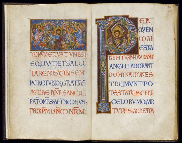 I was hard put to it to decide which beautiful picture to use as an illustration of my recent visit to this exhibition and eventually decided on this page from a Latin Kingdom of Jersusalem sacramentary, dated around 1128. I love it for the east-meets-west style of the icon panel, and the beautiful versal script. I am learning how to write versals at the moment, this is definitely one to add to the study list.
A must-go exhibition for iconographers, illuminators and scribes - on till December, so don't miss. Many of the manuscripts are in cases of course, giving the usual difficulty for close examination, but there are many cuttings framed on the wall which one can eyeball closely. There are also handy reference copies of the £30 exhibition catalogue lying everywhere, which means one can examine photographs and read up on detail without expense. Give yourself a good couple of hours and try to get there early before the usual headphone brigade are there blocking the view! Many of the manuscripts are from the University collection, but there are also borrowings from the British Library, the Archbishop of Canterbury's Library and elsewhere. The later medieval and early Renaissance period is quite heavily represented, as one might expect. The show's chief focus is on the chemistry and provenance of pigments and materials used in book illumination but technique is also touched on. Iconographers will be interested to study the gradual development of different fleshpainting techniques, from the fully modelled style of the Byzantine period through to western experiments with pointillism, grisaille and tinted drawing. Other random gleanings that I shall follow up on my next trip: - Different ways of ruling the page: pricking, hardpoint, silverpoint, plummet. Medieval readers preferred their pages to be ruled and even drew in guidelines to the first printed books because the page looked naked without! So this business in calligraphy class about not showing the lines is a load of rubbish, ha! - Using black gesso under gilding for special effect. Must try, could look amazingly contemporary. - Indigo and woad are chemically indistinguishable when used as dyes or pigments. Western artists probably used woad. It will grow in the back garden, and I found someone on line who extracts and sells the pigment. - The fabled Tyrian purple, so expensive, was extracted from North Atlantic dogwhelks as well as from the Mediterranean murex. The farthest Scottish islands had a trade in it. On the other hand there was a cheap subsitute to be made from the turnsole plant or a variety of lichen, used on some of those glorious purple-dyed manuscripts. - Some French manuscript fragments c 1250 were described as having a 'stained glass palette', an artistic cross-fertilisation from the contemporaneous technological developments in coloured glass (remember that amazing Chartres Cathedral blue?). One of the pigments used was minium. I have always held off using minium (red lead) on the grounds of it being so toxic, but I suppose that's a bit daft given that I already use vermilion (mercury), white lead (for gesso) and the cadmiums. I am interested in this manuscript school, and up till now have had to guess at what pigments were used to achieve the effect.
I have had these two gentlemen on my desk ever since my pilgrimage to the medieval Spanish art at MNAC in Barcelona back in February, and mounted them to my sale page last night thinking they were finished at last - until my dear husband pointed out that I have neglected to paint the white highlights on one of them. Not varnished yet, fortunately, so I can correct the omission. The florid borders, a departure for me, are a homage to a Spanish altarpiece I studied and a reference to the origins of the great saint and his brave disciple. We used to recite St Ignatius' prayer in assembly at my junior school nearly half a hundred years ago: a surprising choice, given that it was not in any way a religious foundation, never mind Catholic. Teach us, good Lord, to serve you as you deserve; to give and not to count the cost; to fight and not to heed the wounds; to toil and not to seek for rest...... The words always inspired a certain inward terror of the martyr's steely determination. My best friend began a fascination which led him to become a Jesuit himself, and for reasons entirely personal I named my own son Xavier. St Ignatius endures, but last time I passed by the school it had been razed to the ground.
|

The view from my deskCurrent work, places and events, art travel, and interesting snippets about Christian icons, medieval art, manuscript illumination, egg tempera,, gilding, technique and materials. Categories
All
Archives
January 2024
|


 RSS Feed